
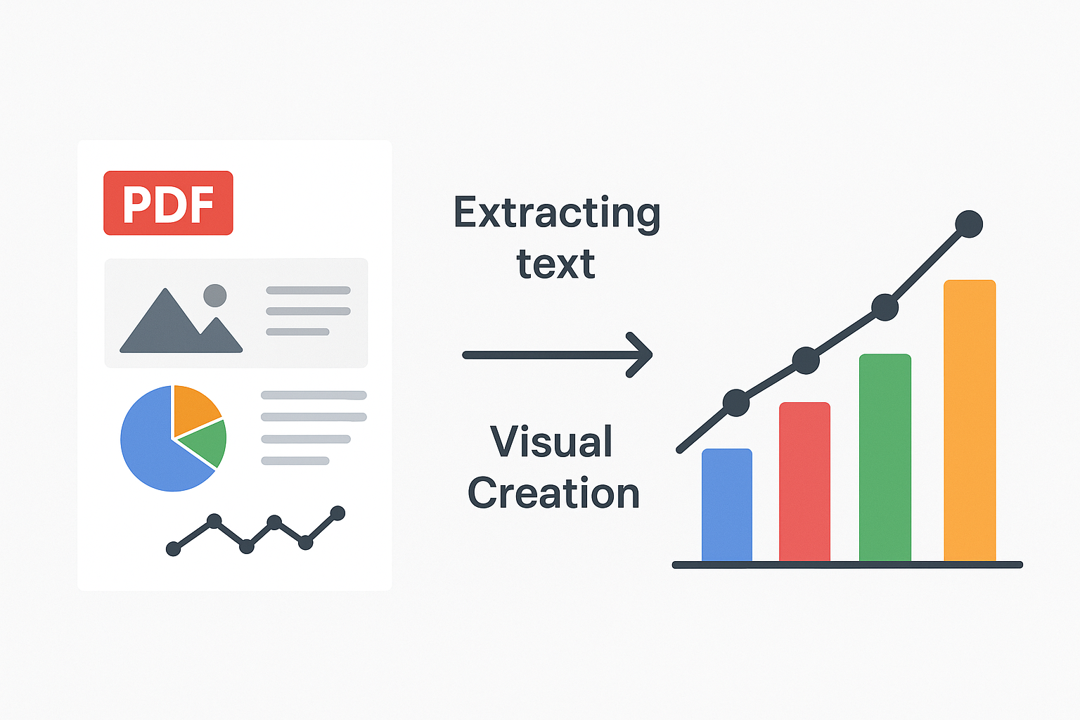
In this hands-on guide, we explore how PicDoc AI transforms raw ideas into polished visuals ready for any presentation. With just text, you can instantly generate clear diagrams, charts, and plots that bring concepts to life. You can also upload images or PDFs to extract text, summarize content, and turn it into structured visuals. Every element of these visuals is editable, giving you full control to refine and adapt them to your needs.
PicDoc is your intuitive partner for visual communication. This AI-powered tool streamlines the diagram creation process, letting you focus on your message, not the mechanics. Leveraging advanced large language models (LLMs) and sophisticated image generation AI, PicDoc understands your textual input and translates it into professional-grade diagrams. It’s designed to save you time, enhance clarity, and ensure your presentations always make a powerful impact, making complex ideas effortlessly visual.
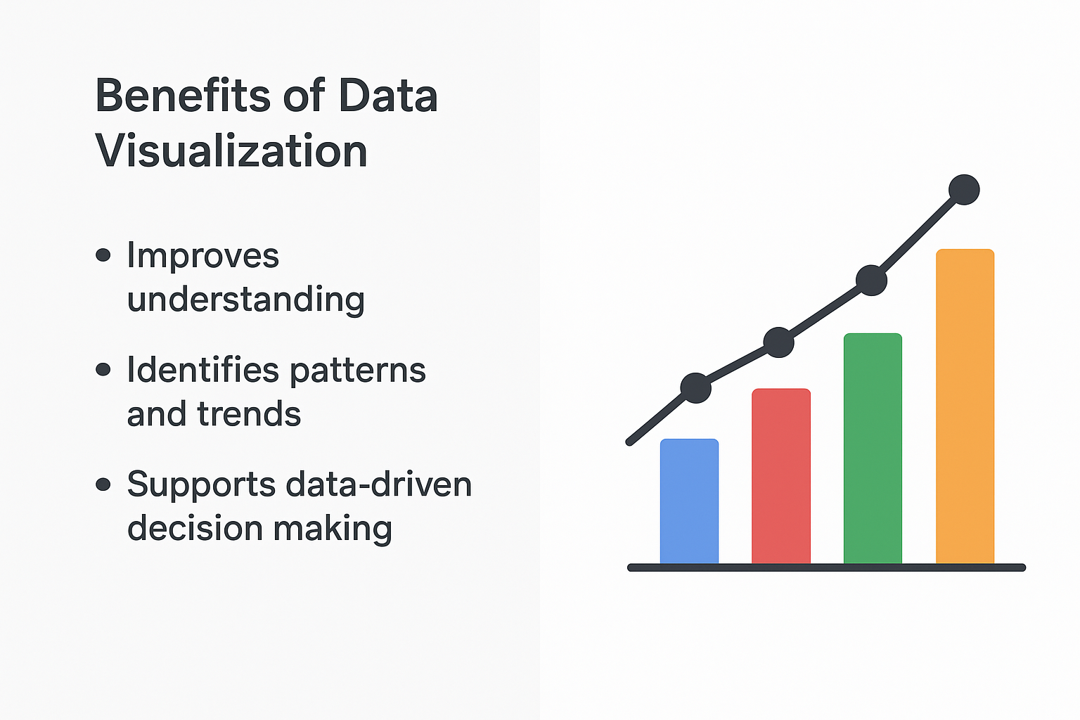
Representative image for text vs visual
Having seen PicDoc’s core capabilities, let’s delve into the diverse world of visual communication it brings to your fingertips. PicDoc supports a wide array of diagram types, each tailored to convey specific information effectively, from illustrating complex processes to comparing data points. The best part is that the application figures out the apt visuals itself and provides multiple options for the users to choose from.
Flowcharts are ideal for visualizing processes, workflows, or decision paths. They use standardized shapes to represent different steps, actions, or choices, making complex sequences easy to understand at a glance. They’re excellent for process documentation, algorithm design, and project planning.
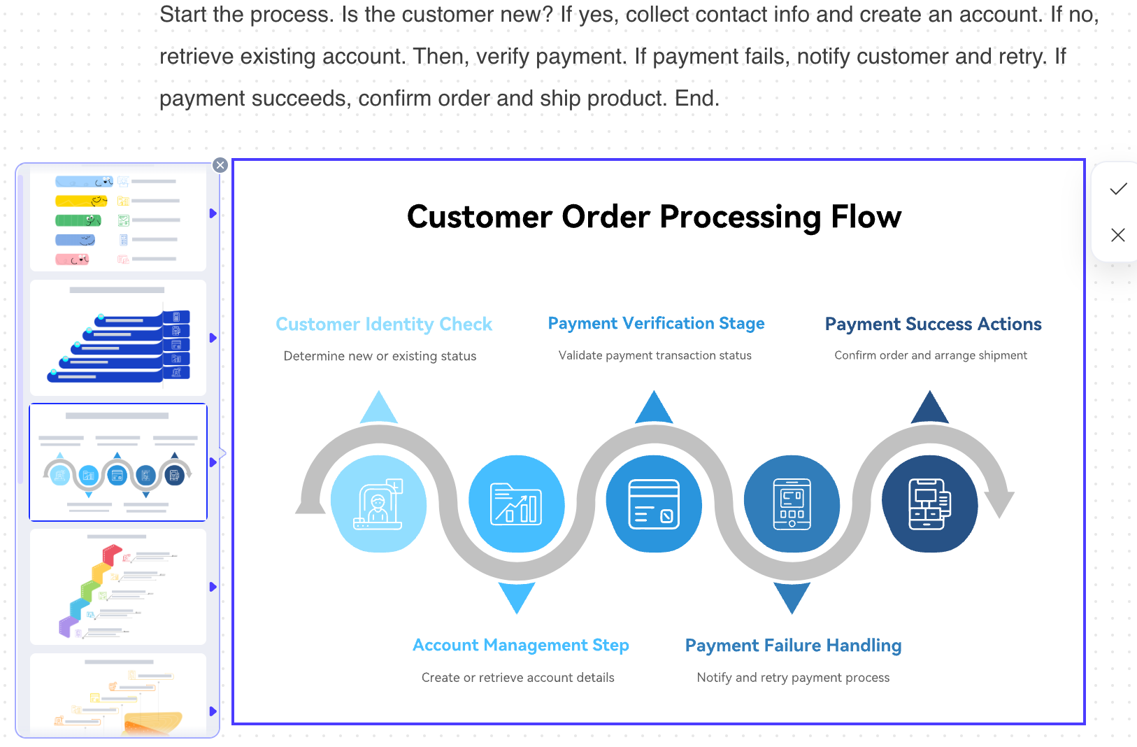
Flowchart created with prompt
These charts are perfect for comparing different categories of data or tracking changes over time. They use rectangular bars (either vertical or horizontal) whose lengths are proportional to the values they represent, providing a quick visual comparison of magnitudes.
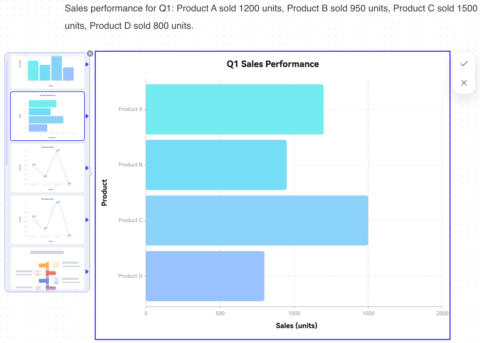
Column chart created with prompt
Pie charts are used to show the proportional distribution of a whole. Each slice of the pie represents a category’s contribution to the total, making it easy to see the percentage breakdown of different components within a single dataset. There are numerous creative ways to visualize the distribution; one example is shown below.
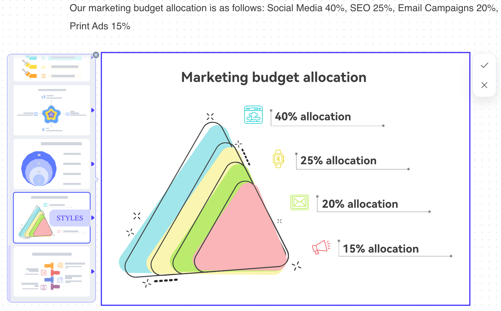
A creative alternative to a pie chart
Org charts visually represent the structure of a company or team, showing hierarchies, reporting relationships, and departments. They use boxes for roles/individuals and lines to connect them, providing clarity on who reports to whom and the overall organizational framework.
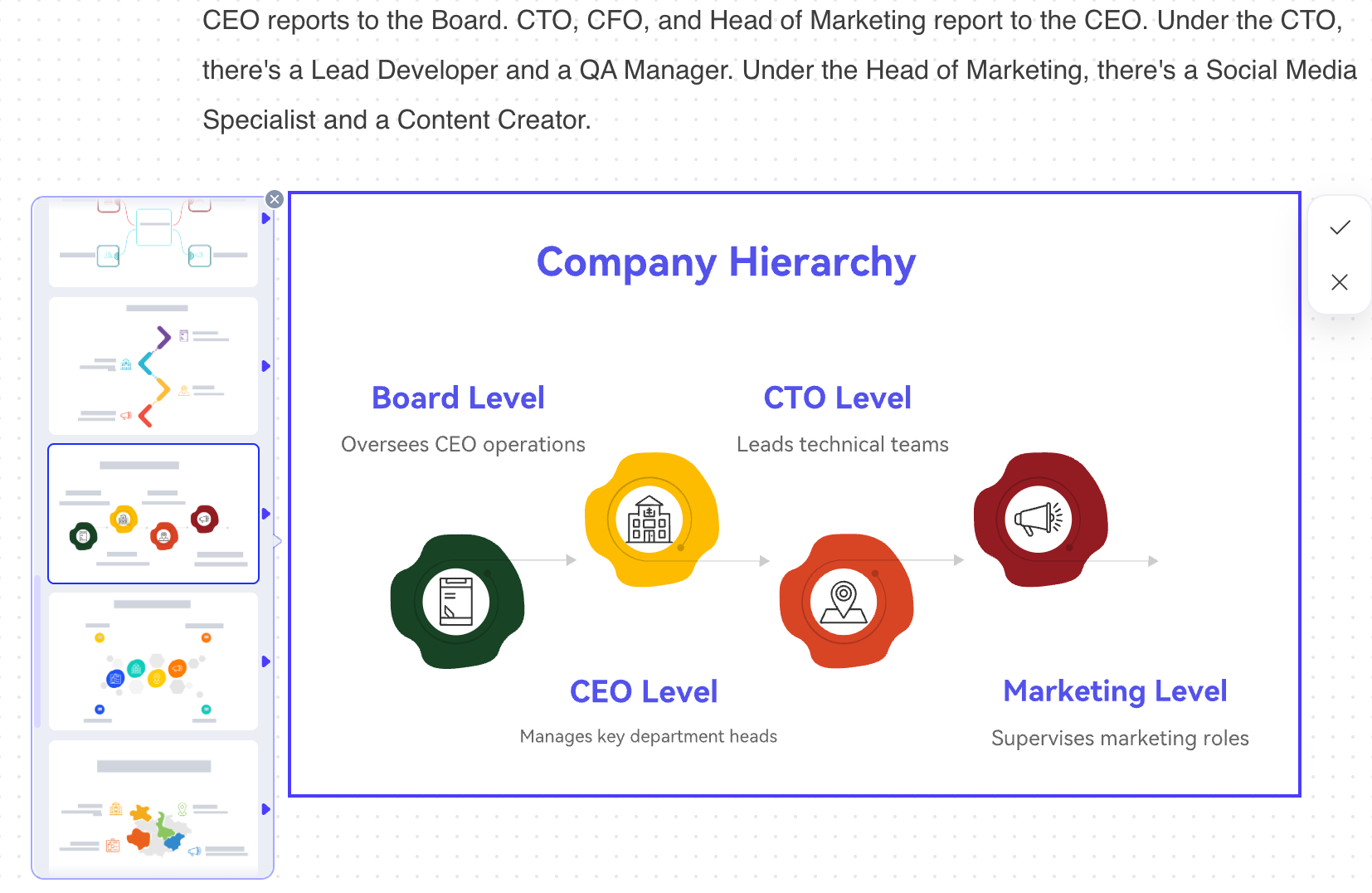
Org chart created with prompt
Gantt charts are powerful tools for project management, illustrating project schedules. They break down a project into individual tasks, showing their start and end dates, durations, and dependencies against a timeline, providing a clear overview of progress.
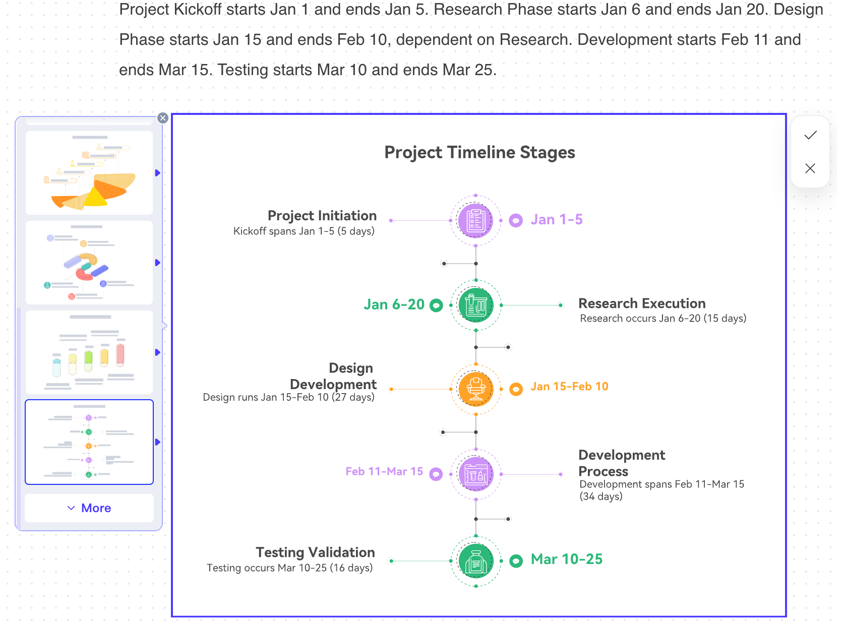
Workflow chart created with prompt
This category highlights PicDoc’s versatility, demonstrating its ability to interpret and visualize almost any structured or semi-structured textual information into a relevant and engaging visual. Whether it’s a simple list, a relationship map, or a custom visual idea, PicDoc aims to find the best graphical representation to make your data more digestible and impactful.
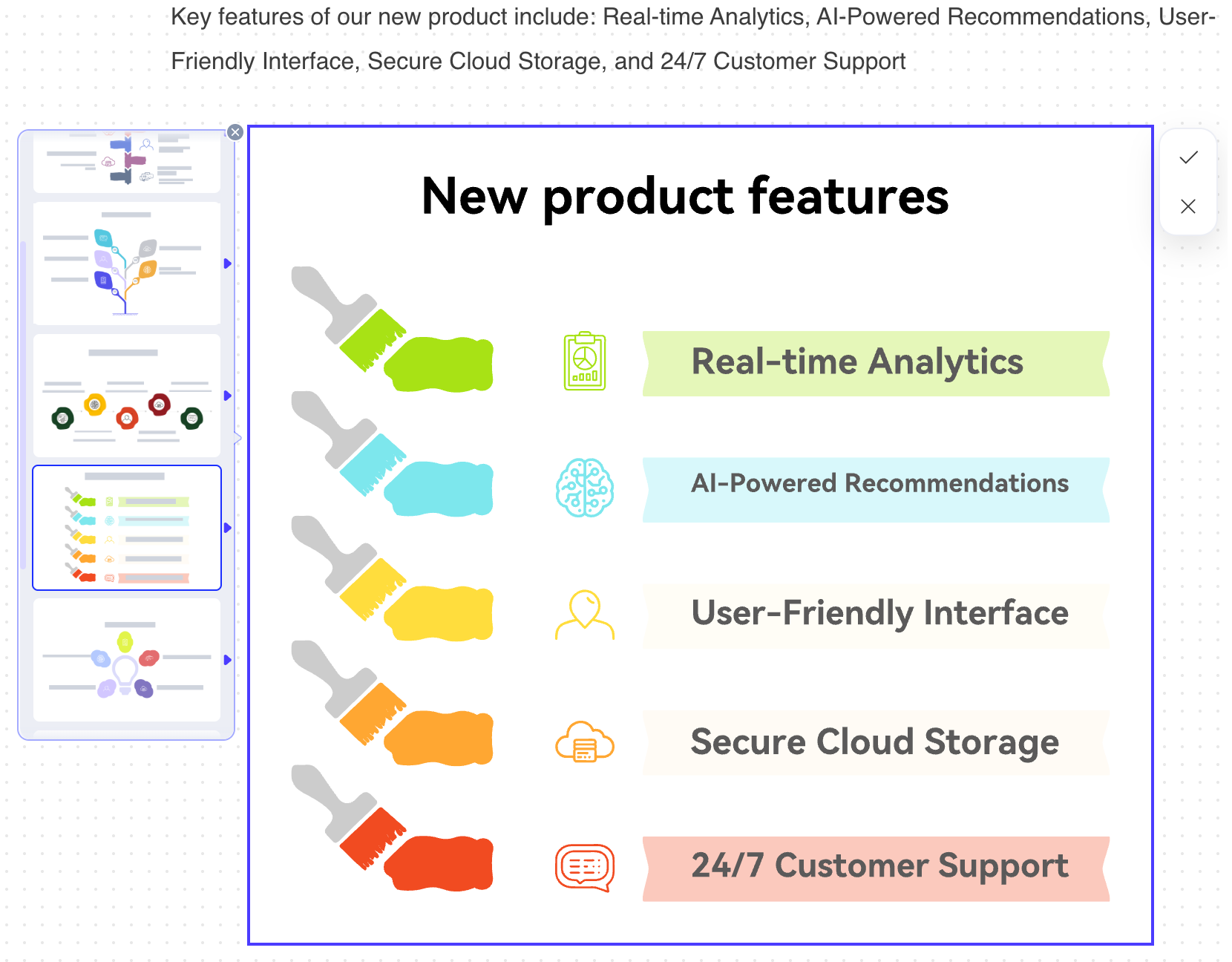
Misc chart from an unstructured text
PicDoc transcends simple diagram generation by empowering users to construct complete, multi-faceted articles directly within its interface. With a comprehensive prompt, you can generate a full-fledged document, ranging from detailed reports to extensive guides, all within a unified environment. To begin, click the dedicated AI article generation option at the bottom of an empty canvas or type ‘/’ to invoke the command.
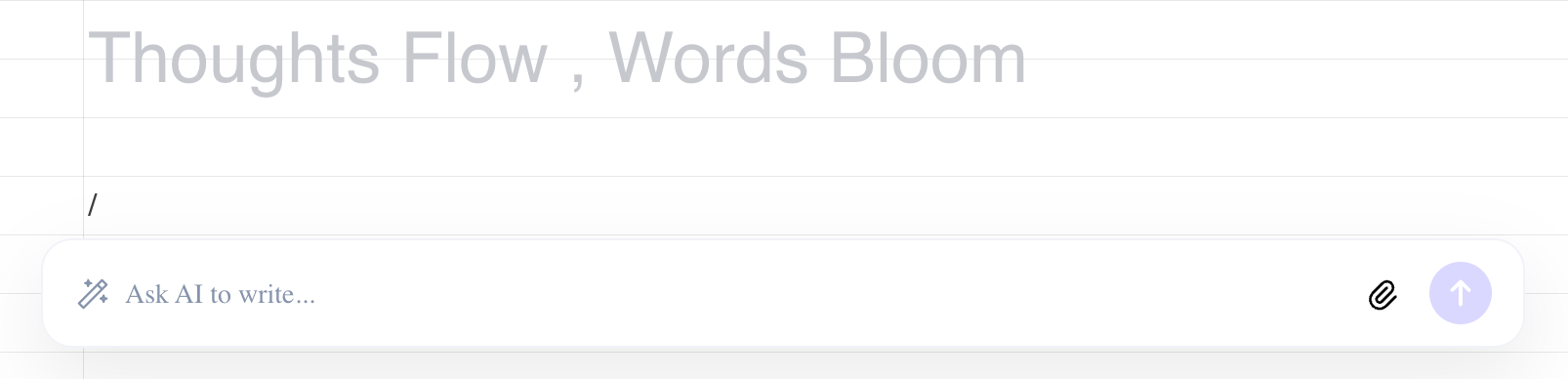
Using ‘/’ to prompt for an article
The true power emerges when you transition from text to visual. As you review your generated article, you’ll notice a subtle yet powerful blue icon appearing to the left of any selected or highlighted text that contains structured information. A simple click on this icon instantly transforms that textual segment into a perfectly suited diagram, chart, or visual representation. This seamless integration allows you to dynamically illustrate key points, data, or processes from your written content.
PicDoc significantly expands its utility by allowing you to integrate external files directly into your workflow. You can upload up to three PDF, DOC, JPG, or PNG files, from which PicDoc’s AI will efficiently extract text and provide concise summaries of the content. This powerful feature is invaluable for enhancing existing diagrams or generating new ones. For instance, you could upload a complex report (PDF) to extract key textual information, then use that summarized text in a subsequent step to automatically generate a new, insightful visualization, streamlining your data-to-diagram process with remarkable ease and precision.
Document to text to visual
PicDoc offers extensive customization to ensure your diagrams perfectly align with your presentation’s aesthetic. Beyond initial generation, you have full control to refine every element. Easily update text, modify graphics, and adjust layouts directly within the diagram. Furthermore, PicDoc allows you to tweak colors, themes, and backgrounds, enabling seamless integration with your existing brand guidelines or presentation design. This comprehensive editing capability ensures your visuals are not only accurate but also visually consistent and impactful.
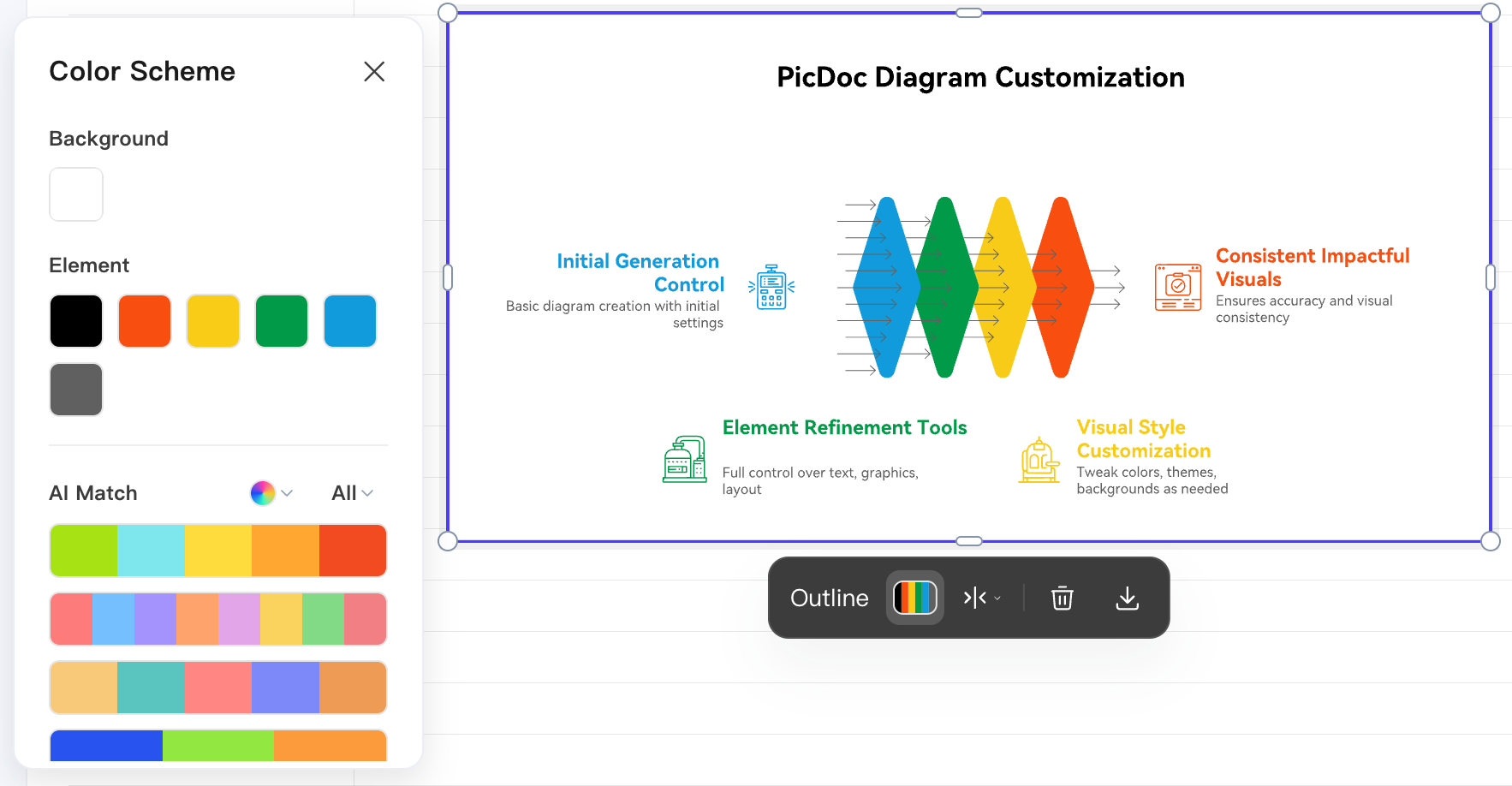
Customization options in the diagram
PicDoc ensures seamless integration into any project with robust download options. You can export your polished visuals as JPG, PNG, PDF, or even PPT files, offering ultimate flexibility. Choose from three different resolutions to match your quality needs, and utilize the convenient feature to remove backgrounds, making your diagrams perfect for any presentation, document, or web use. This versatility ensures your PicDoc creations are always ready to enhance your work.
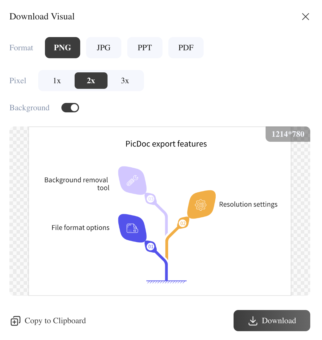
Download options for a diagram
PicDoc is more than a tool, it’s an invitation to experiment, iterate, and discover new ways of telling your story. Don’t stop at the basics; push its boundaries, try unexpected inputs, and uncover creative possibilities. The more you explore, the more you’ll unlock its true potential for impactful communication.


![[Upcoming Webinar] Autonomous Enterprises: How to leverage Agentic AI in Enterprises?](https://adasci.org/wp-content/uploads/2025/10/Adasci-Webinar-1-300x300.png)